Monday, March 4, 2013

Close Ups


Colourful Pens

this is a good close up as it shows different colours and lines. the bright colours also stand out on the dark background. we took this photo on a digital camera in lesson.


Apple Mac

i like this close up as the symbol is in the middle of the picture and nothing takes attention off it. we took this photo on a digital camera in lesson.


Key Board

This close up is of an Apple Mac keyboard. I liked this image as there are different lines and shading on the keyboard.  we took this photo on a digital camera in lesson.


Lock

i liked this image as it is very central and nothing grabs attention off the main focus. we took this photo on a digital camera in lesson.


Pens

i love this image as it shows lines and colours, it is also very different from other photos i have seen on this project. we took this photo on a digital camera in lesson.


Friday, March 1, 2013

Our Photos


This is one of our photos where we were focusing on lines in the image. this image was taken on a Samsung digital camera. I liked this image because you know what the focus is ment to be on and there are no other distractions in the image.


 I liked this photo that we took as this image shows different textures in the water. this image was also taken on a Samsung digital camera.


 This is an image we took with the Samsung digital camera and i think it shows a lot of different patterns in the tree, there are straight lines, bent lines, wavey lines, there is so much detail in this image and there is nothing in the image that could distract you from the image. the colours also make the image more dark and mysteriouse, which is different.


 This is one of the worst images we took on the camera as the light of the camera reflected in the glass and is a distraction to the image.


 this is a photo we took in our school on the stairway. this image shows many lines and it follows the rule of thirds as your eyes are directed to the left third of the image. there are no distractions in this image. generally a very good image to show lines.


 this is a very good image to show patterns and texture. the image is simple and is the speckled floor in our school this was also taken on a Samsung digital camera. because of the simpleness of this picture there are no distractions and it is a very good image.


this image was taken in our school on the digital camera. this image is focused on the center on the image. the bright red colour in the image stands out on the cream/yellow background so the main focus is stood out more.
 

 This is one of the bad images we took on the camera as the light of the camera reflected in the shiny surface and is a distraction to the image.the image is also at an angle and slightly slopes.


Can you make a photo look intresting?


This is one of the better pictures taken for this project. it shows both of the girls in the image and does not cut off any of there faces. This photo was taken on an apple mac computer so we used the effect sepia for this image as it is a very nice effect but does not take the main focus of the image which is the two girls.


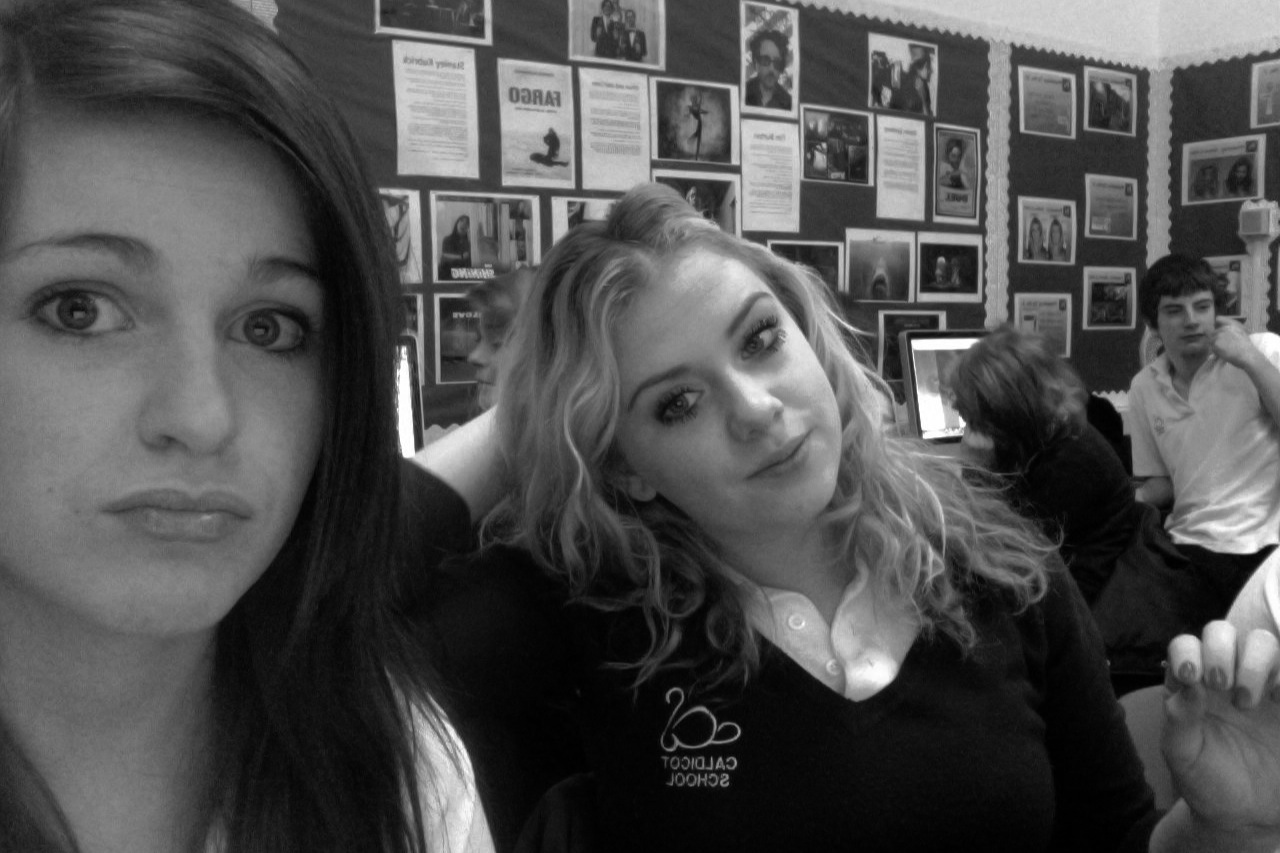
This is a bad photo that we took as the background has a lot going on and takes the focus of the image off the two girls. This photo was also taken on an apple mac computer but we used the effect black and white as it was different than a normal photo. this would have been a good photo if the camera was aimed properly so the main focus was the two girls.


This again was another bad photo as it was blurry and you can not make much detail out of the picture, this image also cuts of the girl on the rights face which should have been the main focus. this image again was taken on an apple mac computer for our project and we kept the effect black and white. overall this was a bad photo as there was no focus.


This was one of the better images although the boy in the background does steal some focus from the girls. both of the girls are fully in the picture and are not cut off from image. This image was taken on an apple mac computer in lesson for our project and again we used the effect black and white as this effect generally improves a photo, i believe this anyway.

taking photos


this is a picture i made showing the process it takes to take photos and upload them onto a social media website.